
The product
An app that will make ordering customised coffees and snacks from a café, easier.
The problem
Incorrect orders when something needs customisation. Not enough options.
Project duration
January – May 2021
The goal
My role
Responsibilities
Save time while ordering. Feel like their requirements are met.
UX designer, creating the app for Coffee Time from conception to delivery.
- Conducting interviews
- Paper and digital wireframing
- Low and high fidelity prototyping
- Conducting usability studies, accounting on accessibility
- Design iteration
Understanding the user
User research: summary
I conducted interviews with people who fit my end user profile. I wanted to know about their challenges when ordering coffee and snacks online, and how they feel their experience would be better. I got useful insights into their process, their pain points and how they would like their requirements to be met.
Personas
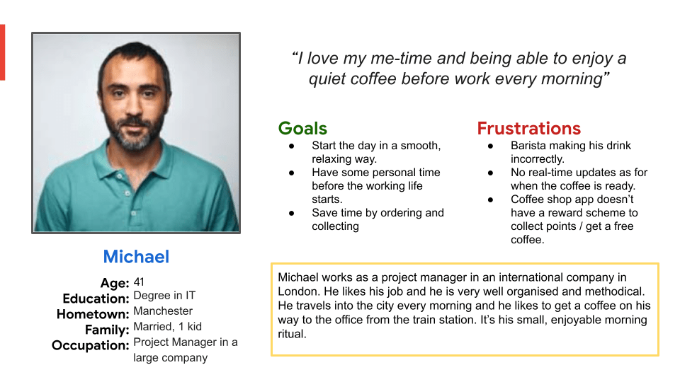
Michael
Michael is someone who travels into the city for work. He needs to order his coffee in advance because he doesn’t have the time to queue every morning before work.
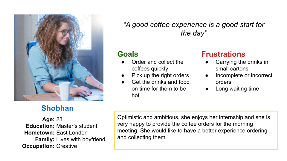
Shobhan
Shobhan is doing an internship for a creative agency and she enjoys the morning coffee run. She wants to pick up the right orders, while the coffee is still hot (or cold).
User journey maps
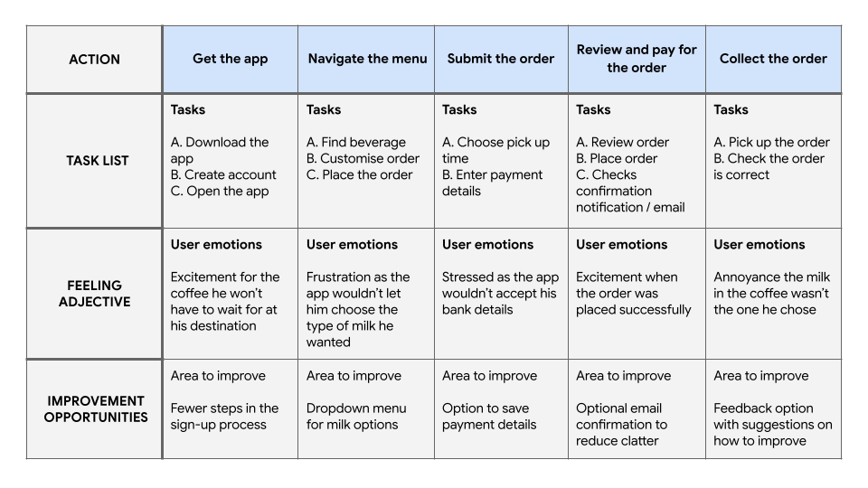
Michael
Mapping Michael’s journey revealed how helpful it would be for users to have access to an easier-to-order order Coffee Time app.
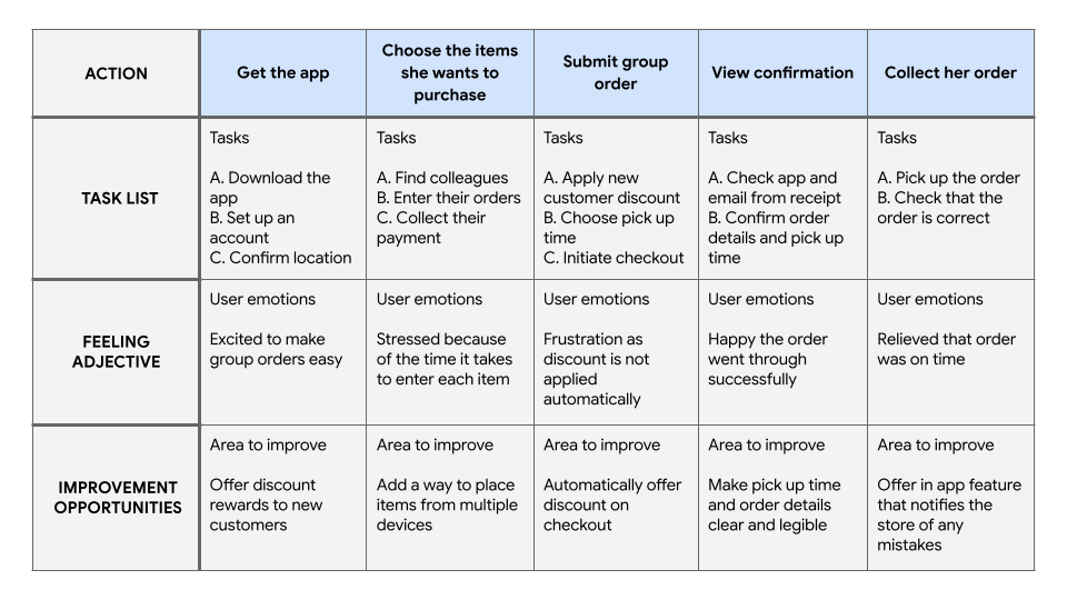
Shobhan
Shobhan’ s journey revealed how helpful it would be for users if connected accounts could place items on the same order.
Pain points
Incorrect drink
Complicated process
No real-time update
Most mistakes happen when the drink or snack is customised. Focusing on the design of an app that prioritise customisation, will solve this problem.
The users want an app where they can order repeated items regularly, without the need of customisation every time.
The user can’t know how long it will take for their order to be ready.
Designing the app
Starting the design
I started with concepts and paper wireframes before working with Figma for a low-fidelity prototype. The process was concluded with usability studies to identify areas of improvement.
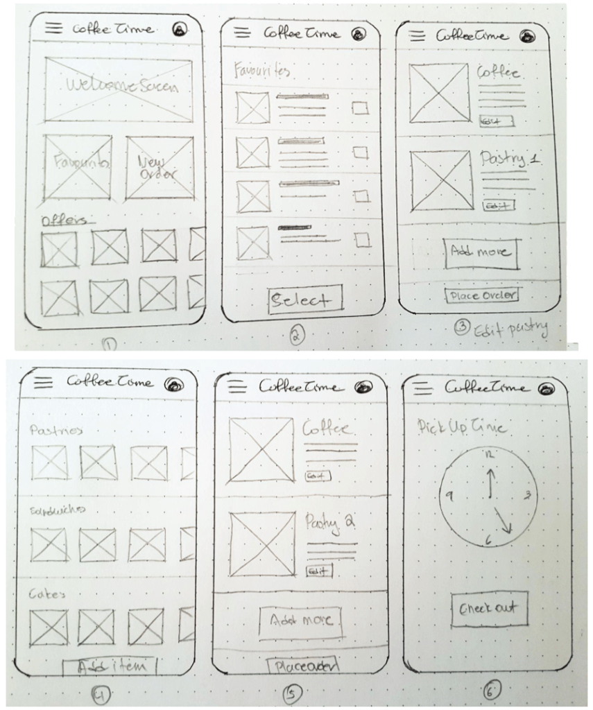
Paper wireframes
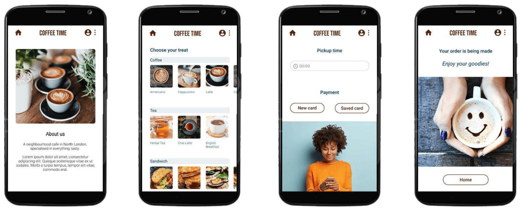
Taking the time to draft iterations of each screen of the app on paper ensured that the elements that made it to digital wireframes would be well-suited to address user pain points. For the home screen, I prioritised the Favourites menu, to help users save time.
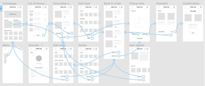
Digital wireframes
As the initial design phase continued, I made sure to base screen designs on feedback and findings from the user research.
Low-fidelity prototype
I worked in Figma creating an interactive low-fidelity prototype.
Usability study
Parameters
Study type
Participants
Location
Length
Unmoderated usability study
Four males, one female between
the ages of 33-51
London, remote
15 minutes / participant
Findings
I conducted two rounds of usability studies. Findings from the first study helped identify issues with the user flow. Findings of the second study helped me refine the design.
Confusing payment process
Unable to rate their order
No Cancel button
Users want to rename the final button to the more straightforward Pay.
Users want the option to add/remove items from their Favourites list.
Users want to be able to cancel their order before paying.
Elevating the process
Refining the design
Following the usability study contacted using the low-fidelity prototype, I worked on more refined mock-ups and a high-fidelity prototype. Digital accessibility was also considered in this stage of the process.
Mock-ups
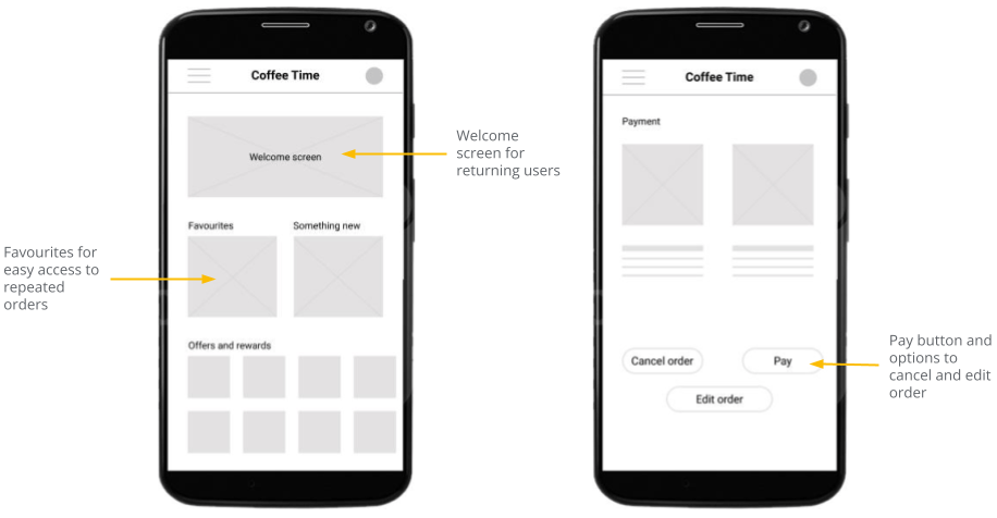
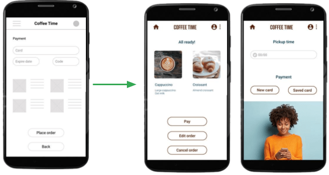
In my initial designs, I included a larger welcome screen and a carousel of offers and rewards on the main page. I changed it, leaving only two options on the main page making it easier for the user to choose their items.
The usability study revealed that the ‘Place Order’ button was confusing as it proceeded to payment without confirmation.
I added more screens to give the user the option to cancel and/or edit their order before paying.
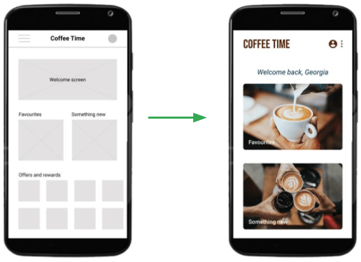
High-fidelity prototype
I worked in Figma creating an interactive high-fidelity prototype. Some basic UI design was also applied in this stage though not a priority.
Accessibility considerations
Alt-text
Navigation
Consistency
Added alt text to images for screen readers to provide access to users who are vision impaired.
Used icons to make navigation easier.
Used bold images representing all items on sale to make it easier for the user to know what they need.
Going forward
Takeaways
Impact
What I learnt
The app helps the user to quickly place an order and get a pickup time.
When I started with this design, I thought no changes were going to be made during the process. Usability studies and peer feedback helped me to update my designs.
Next steps
Further usability studies
Follow-up new feedback
Further user research
Conduct another round of usability studies to validate whether the pain points users experienced have been effectively addressed.
Add a ‘Repeat order’ button for recurring orders as most users buy their regular coffee every morning without much variety.
Conduct more user research to determine any new areas of need.
