Data visualisations help me make sense of the world around me. They can be professional, like technical information presented in a clear and engaging way to a non-technical audience. Student trends that showcase international mobility, strengths, aspirations, and dreams. They can be personal, like making sense of a global pandemic.

Inspiration
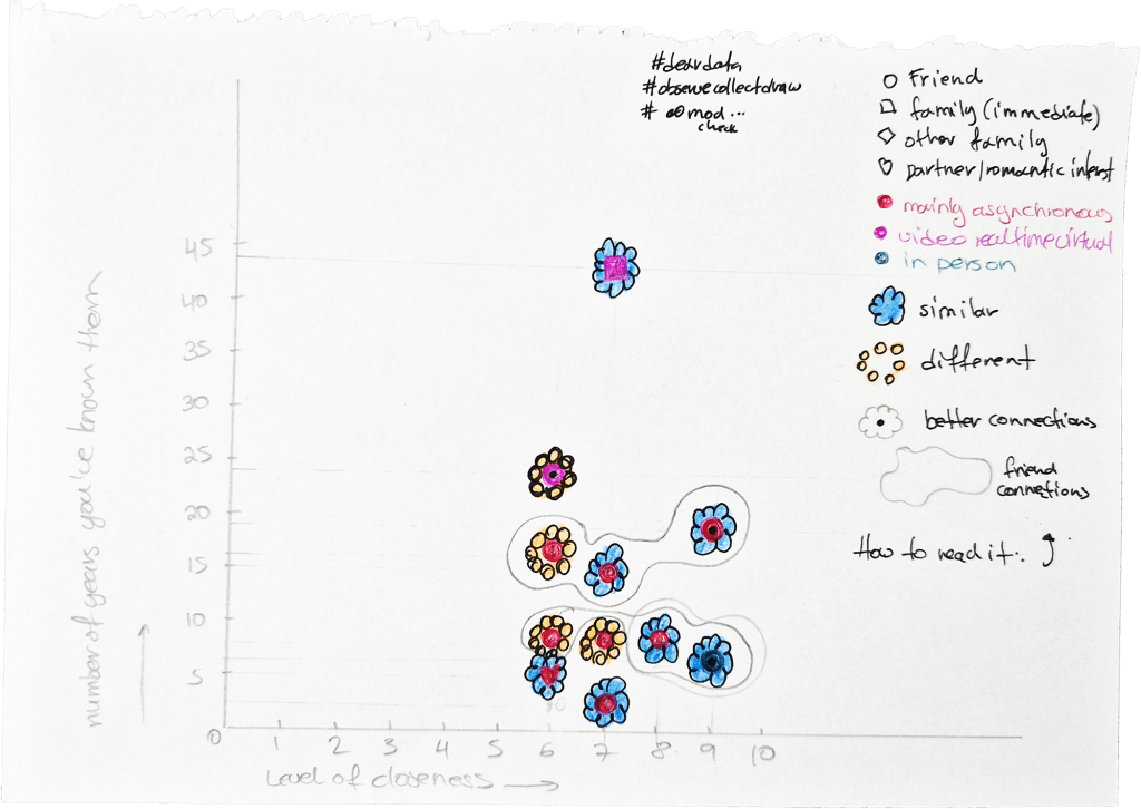
In the autumn of 2020 I attended an online event on data visualisation hosted by Graphic Hunters in the Netherlands. Some of the most inspiring people in data vis were presenting, such as Giorgia Lupi and Stephanie Posavec. I am a big fan of their Dear Data project, in which they recorded their lives for a year, sending handmade data visualisations to each other every week.
While I was doodling away during the presentations, I was inspired to create a personal project that aimed to make sense of the first six months of Covid 19. Like most people, I found myself isolating with lots of time in my hands and wanted to pinpoint how my time was spent.
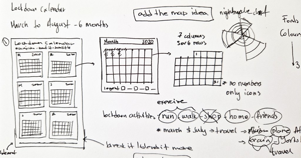
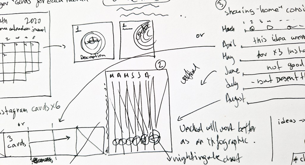
I started with writing down what I wanted to show, and the ways I could show it. An initial idea of using a map didn’t go too far (as I didn’t either). I created concepts for an idea using monthly calendars. Those would show clearly the long days of lockdowns, but they wouldn’t be comparable.
I needed a bar chart.
Styleguide
Once I decided the form my infographic would take, I defined a styleguide to help me maintain consistency. Initial ideas, inspired by my work at QS’s Top Universities platform at the time, included the creation of a full social media campaign as a personal marketing exercise.

Pandemic days
One thing I had to decide early on was whether I should make the calendar more detailed, showing everything I had been doing, like supermarket visits, if the exercise was a walk or a run, if the meeting with friends was a picnic at the park or a walk somewhere, or later in the summer a meal out or taking the tube.
I decided to keep it simple, documenting only the days I hadn’t been outside, my outdoors exercise, meeting friends, and travel (a flight to Athens at the beginning of March and a Yorkshire road trip in July). I added milestones from the news to give the calendar a context; April’s loneliness makes more sense when there’s the government text message ordering people to stay home, protect the NHS and save lives.

Passion for data
As much as I enjoyed creating this, I had hesitated to share. Who cares about my lockdown activities (besides my mum)? Was this calendar worth sharing as a visual representation of a random person’s life during the UK lockdown? Was I oversharing here?
I love data visualisation and have been attending workshops often. As Jane Pong said during that Graphic Hunters workshop in 2020, “Find data you are interested in and try them out”. This is what I am doing. During my application and interview process for my current role I was asked to share what I considered my best infographic. I shared this, and I got the job.
