My interest in digital accessibility deepened during the UX course I did with Google and Coursera in 2021. Since then, I have actively been applying accessibility standards to our team’s work and led sessions and workshops across the organisation on how to create accessible documents. With a focus on colour theory, I build my presentations utilising Buro Happold projects, and also by creating supporting assets.
What is digital accessibility
Digital accessibility involves creating content and services that cater to all, regardless of their abilities or disabilities. Some examples of disabilities are cognitive, mobility, speech, hearing and vision. For the purpose of this article, I’ll focus on visual impairments with focus on colour accessibility.
While many accessibility fixes such as image tagging can be added in a PDF document (though not ideal), colour accessibility is the most difficult to adapt later. With some thoughtful adjustments when starting work on a project, we can ensure our content is fully accessible by everyone.
Contrast ratio
An important part of colour accessibility is the contrast ratio between colours. Contrast ratio refers to the difference in brightness between foreground content and its background. Higher contrast (over 4.5:1 for normal text) ensures that text and visuals are legible for users with visual impairments.

Choosing appropriate colour combinations ensures that content is readable and distinguishable for all users by providing sufficient contrast and avoiding confusion.

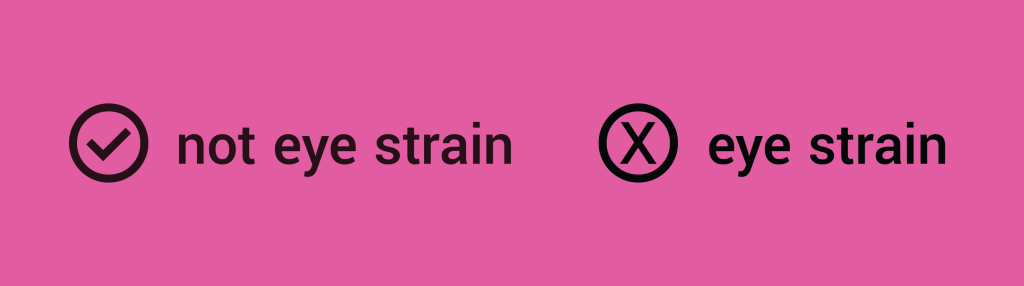
Tints and shades
Using tints and shades of a colour rather than pure black or white enhances accessibility by reducing eye strain and improving readability. Text in a very dark pink colour on a lighter pink for example, is more accessible rather than black text on the same background.
Colour alone isn’t enough
Using colour alone to convey information can exclude users with colour blindness or other visual or cognitive impairments.
In the example, the icons on the right show what a person with colour blindness sees. Relying on colour alone can make critical information invisible to users who perceive colours differently, leading to confusion or missed actions.

Combine colour with text labels or consistent icons to ensure the information is inclusive to all users, including those with visual or cognitive impairments. This approach provides multiple cues for understanding, making your content more accessible.

Consistency
Consistent use of colour helps users quickly understand and navigate content by reinforcing familiar patterns and visual cues. When colours are applied predictably, users can more easily interpret meaning and take action. By applying a unified colour scheme, designers create a predictable and intuitive experience that supports recognition, reduces cognitive load, and enhances overall accessibility.

Online tool for contrast checks
A useful tool to check if our colours are accessible is the Adobe Colour Contrast Checker. It allows users to test the contrast between text and background colours to ensure they meet guidelines for readability. By inputting your chosen colour combinations, you can quickly see whether they pass accessibility thresholds for both normal and large text, helping you create designs that are inclusive and easy to read for all users.

Design isn’t just about how things look. It’s about how they work for everyone. I’m excited by the opportunity to create work that’s not only beautiful but genuinely inclusive.
 Georgia Philippou | Graphic Designer