A big part of my work at Buro Happold was on diagrams supporting reports and presentations. These diagrams had to communicate complex information related to construction to an audience that wasn’t always technical.
It was very important for me to understand what the stakeholders needed to communicate, in order to produce work that was accurate, easy to understand, engaging, and accessible.
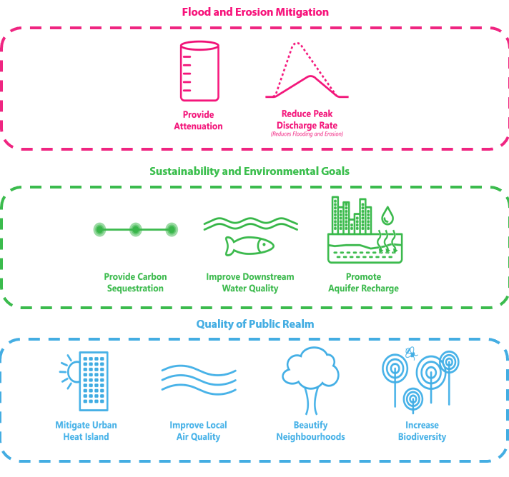
For the diagram presented here, I received an image that wasn’t clear on how its parts were related to each other. There were also issues with accessibility as lengthy text in three different colours was difficult to read.
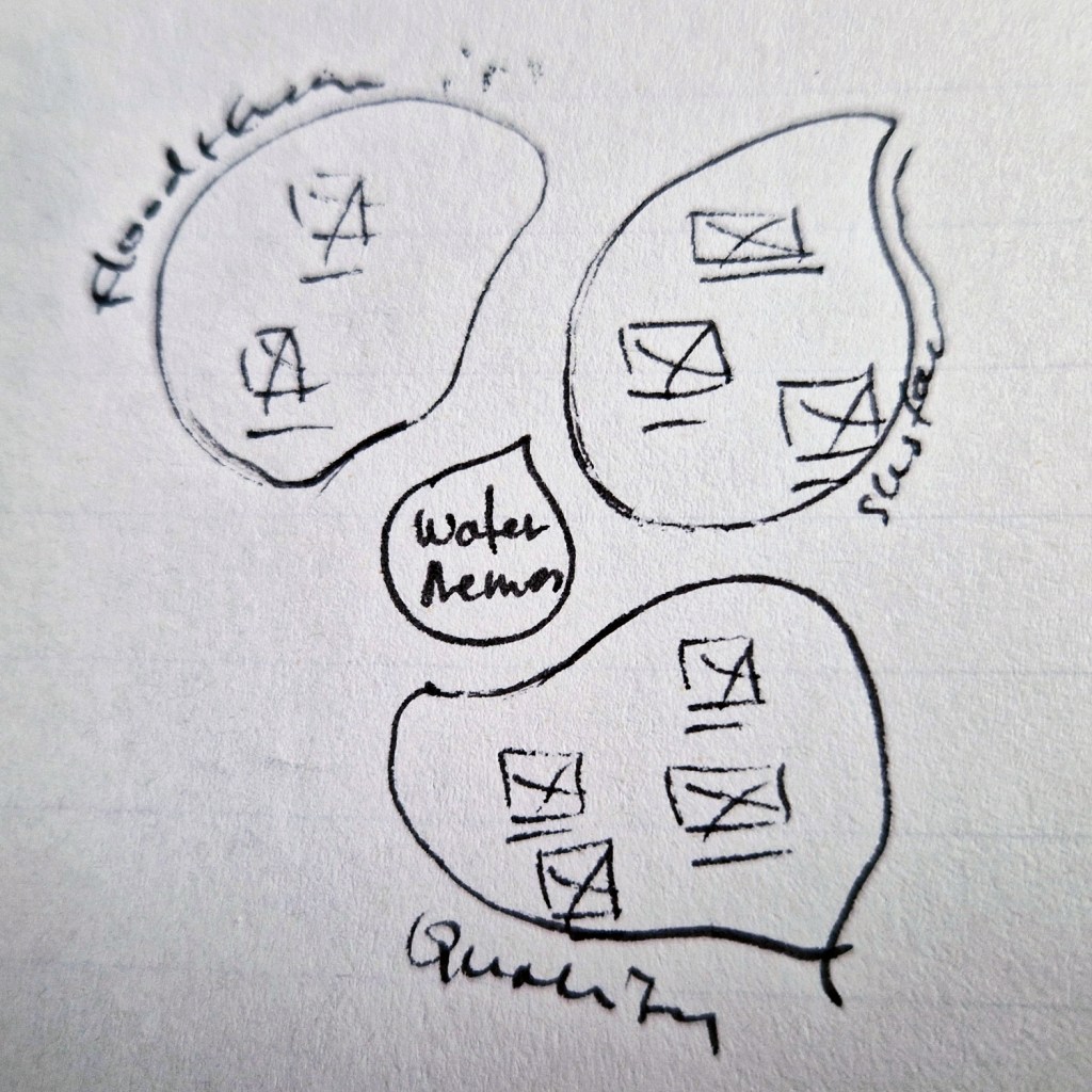
I started work with quick sketches to explore connections and possibilities.
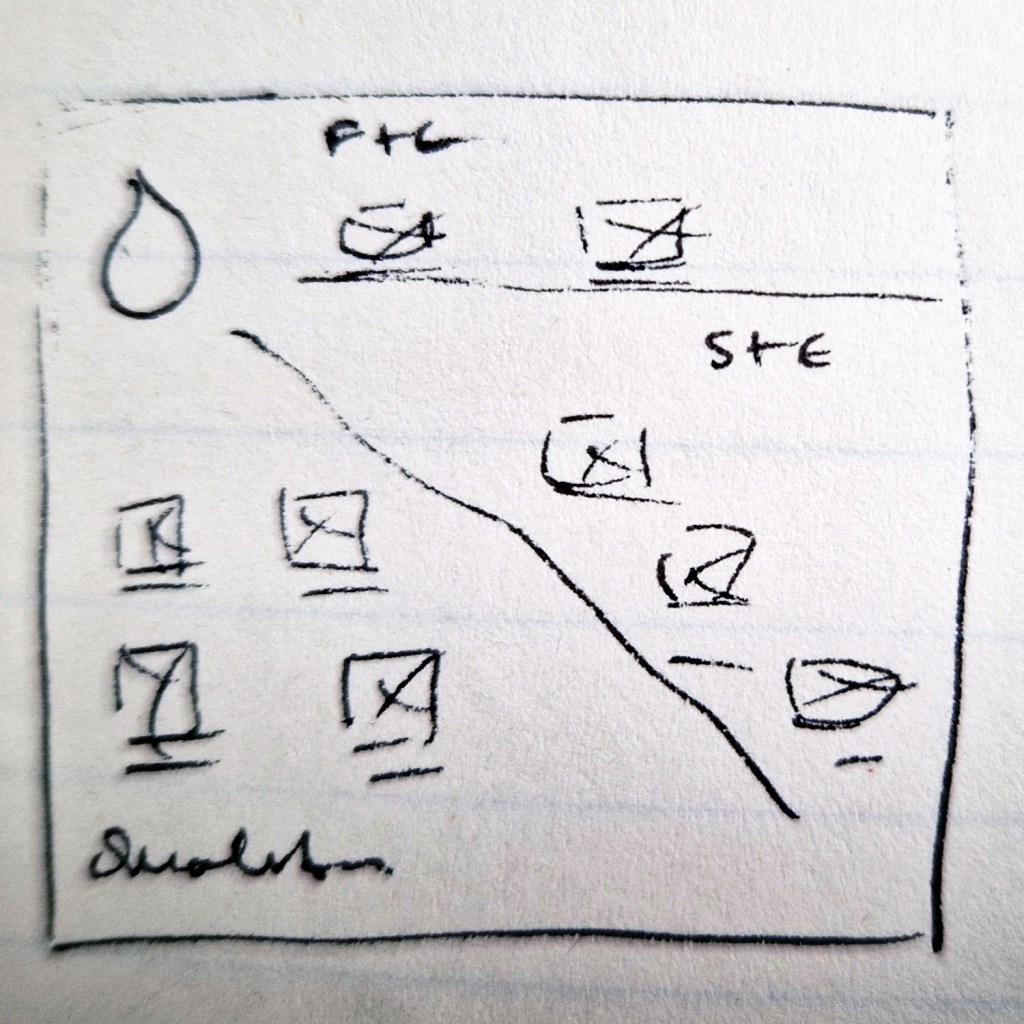
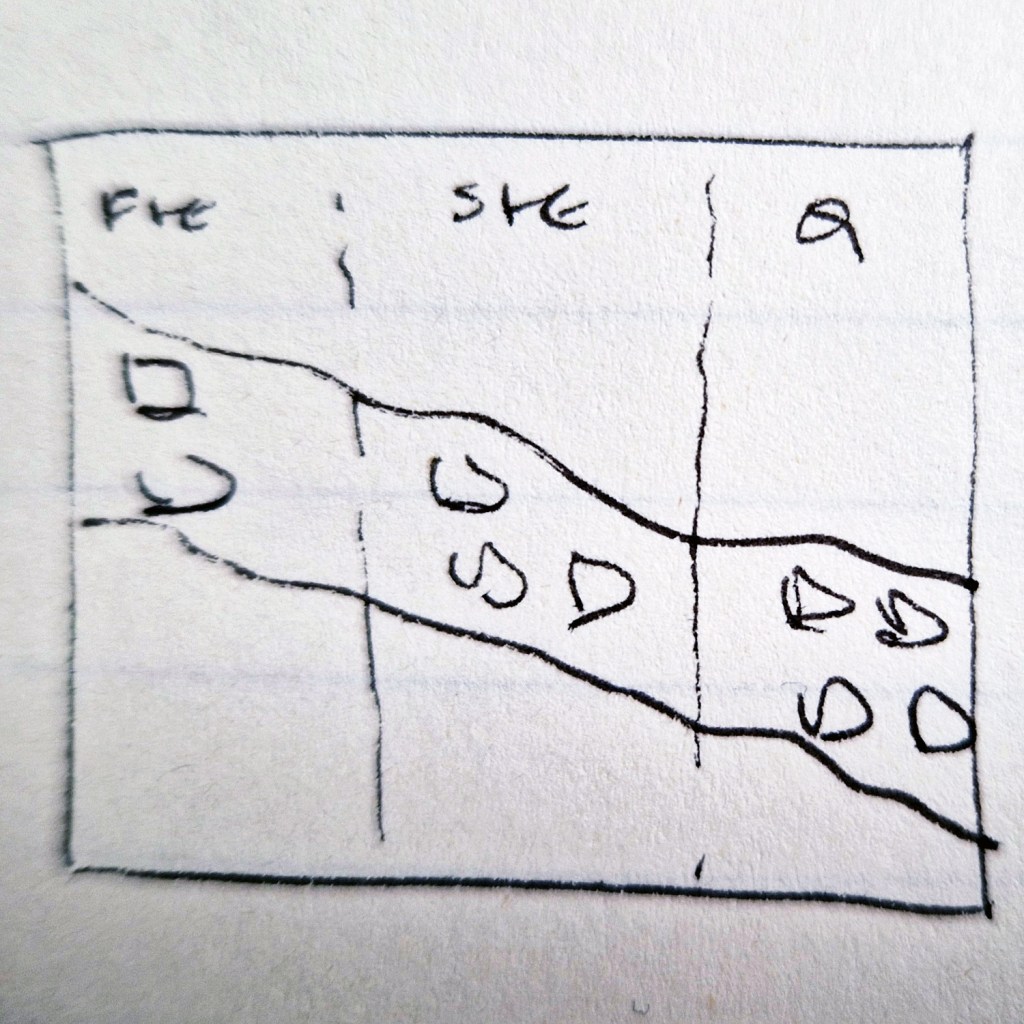
After sharing my work with the client, they decided to proceed with the option that aligned more with their initial image.
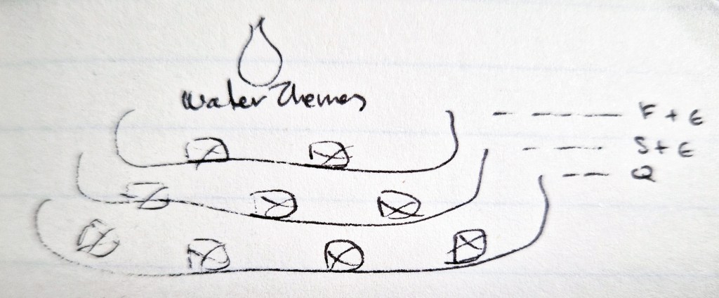
Moving to Adobe Illustrator, I developed the layout emphasizing the flow of the information. I created an accessible palette and pushed the text to much darker hues to make it easier to read.
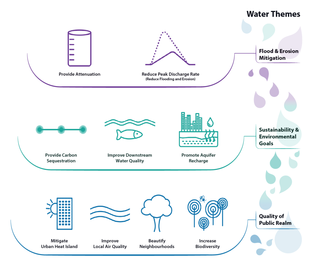
The client was very happy with the result and they are using it on a variety of reports and presentations.

